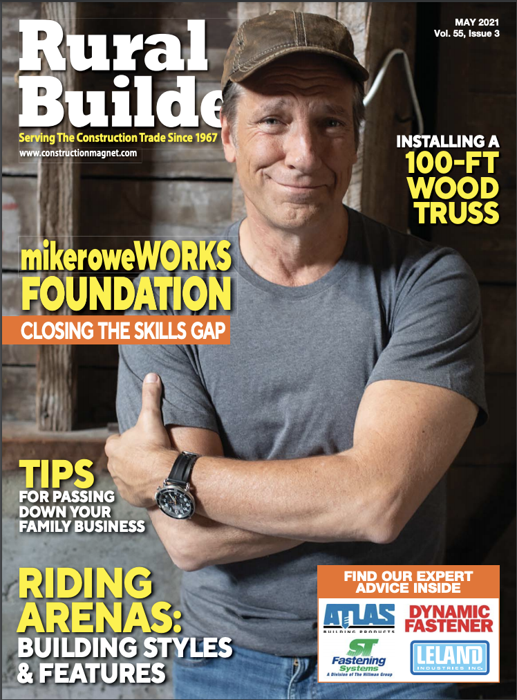
By Rural Builder Staff
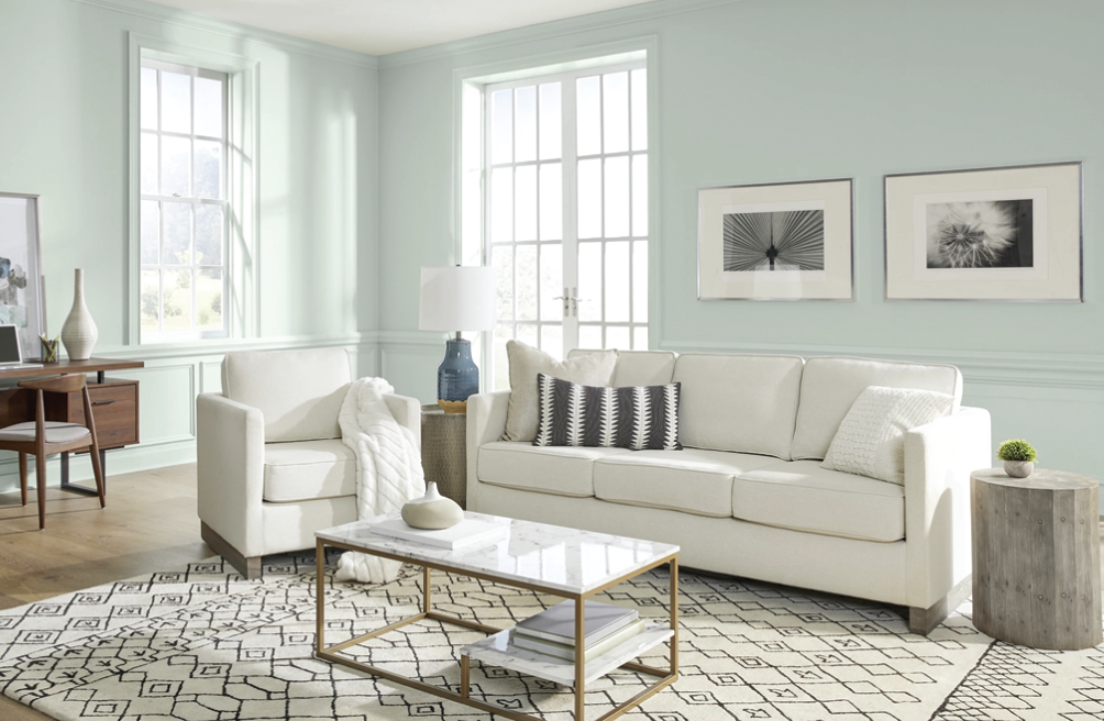
Ruthann Hanlon of PPG gave a color presentation at the Garage, Shed and Carport Builder Show in South Bend, Indiana in November. The psychological aspects involved with the color of siding your client chooses are interesting. For instance, did you know that gray is out because people’s mood and outlook are lifting; they’re becoming more hopeful. So goodbye safe, neutral, not-very-cheerful gray. No offense to gray intended…it can be used to stunning effect, but it was hanging out around the top of the colors-used chart for years. Many homeowners are moving on. And here is what the color experts say they are moving to.
PPG’s Color of The Year
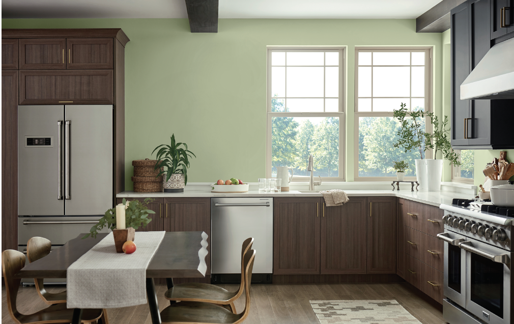
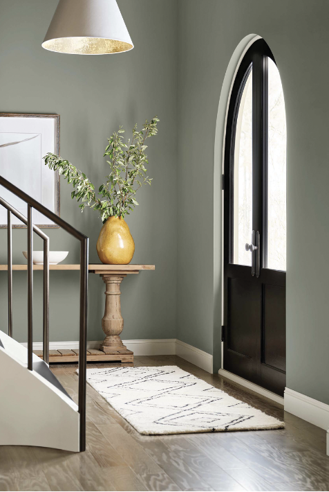
After a year of stay-at-home orders and too few IRL (in-real-life) moments in 2020 and 2021, homeowners, designers, architects and facility managers are craving authenticity, nature and meaningful human interaction after living in a mostly digital world. Our 2022 Color of the Year is Olive Sprig (PPG1125-4), an elegant, grounded, versatile and highly-adaptable grey-green. This color represents regrowth in a post-pandemic world and mimics nature’s resiliency.
Olive Sprig is a relaxed, but enticing green that emulates the feeling of soothing aloe vera or a fragrant plant – brightening any space with organic liveliness. A versatile color that lives well inside or outside, Olive Sprig blends in with nearly any environment.”
“As many of us know following a year of lockdown, the easiest way to shift your mindset is to change your environment. While we begin to trade sweatpants for strappy shoes, recipes for reservations, and a night in for a night out, our paint color preferences are shifting too, in both residential and commercial spaces,” said Amy Donato, senior color marketing manager, PPG paint.
Lending itself to be paired with natural materials, Olive Sprig looks beautiful alongside unique architectural elements and furniture with curved forms to create a comfortable and grounded space. The color can help create a sanctuary in a bedroom, encourage focus in an office, offer the perfect neutral backdrop in a retail or restaurant, and create a grounded getaway in hotels. Olive Sprig also pairs beautifully with brass accents and wood tones on an island or lower kitchen cabinets. Homeowners, designers, architects, and other customers of professional painters can also gather inspiration from this color through the use of floor-to-ceiling emerald tiles in a bathroom, incorporating a luxe velvet green couch in the living room, or immersing the home in plants in a variety of shapes, colors and sizes.
In addition, after the rise of working from home and remote learning, homeowners have shifted away from open concept living spaces to individual rooms in order to create privacy and compartmentalize working life from personal. For those in need of a little more separation, painting a wall or nook a different color from the rest of the room is a simple, affordable project that can instantly transform a space and help create boundaries in your home that will change and adapt as our lives do.
As part of PPG’s annual Global Color Forecasting Workshop, the company’s experts uncovered that consumers are more inclined to adopt more colorful selections after difficult inflection points throughout history, often seen during the Roaring Twenties or after the Great Depression. As part of this cyclical history, PPG is seeing post-pandemic optimism infiltrating commercial and residential design spaces so many can create a sense of escapism. Just as trends in the 1920s were marked by opulence, metallics, rich woods, layers, moody colors and angular shapes, today’s home décor is drawing inspiration from the Antiquity, Baroque and Renaissance eras of art, sculpture and architectural forms. This colorful embrace is thought to reflect an optimistic rebellion, a sign of personal expression or soothing self-care.
Speaking of optimistic colors, Behr Paint has also chosen a shade of green as color of the year.
Behr Paint’s Color Of The Year
“Breezeway” is the perfect connection where a breath of fresh air meets a coat of fresh paint. The tranquil tone launches with BEHR DYNASTY™–our most innovative new product in company history.
Breezeway MQ3-21 is an approachable but noticeable color. The silvery green shade with cool undertones, part of the BEHR® 2022 Color Trends Palette, is inspired by the earth’s beauty and mimics naturally stunning sea glass found on the shore of salty beaches.
Breezeway evokes feelings of coolness and peace while representing a desire to move forward and discover newfound passions. Leading you from one place to the next, the color catches your attention and is an open invitation to experience the world with a fresh perspective, both within the home and beyond your front door.
“A new year brings the opportunity to embrace a sense of renewal and pursue untapped passions,” says Erika Woelfel, vice president of color and creative services at Behr Paint Company. “Whether it’s lacing up our hiking boots, or breaking out the gardening tools, Breezeway inspires us to fully embrace the hobbies or adventures, both near and far, that excite us. We look forward to a color that welcomes a hopeful sense of renewal, restoration and healing.”
Breezeway will be available in the brand’s newest product innovation, BEHR DYNASTY™. The most advanced paint in company history, it’s a four-in-one product that offers DIYers, Pro painters and design professionals a unique product to deliver beautiful and durable results.
It’s the most stain repellent, scuff-resistant- fast drying one-coat coverage paint all in one can within the BEHR product portfolio.
“BEHR DYNASTY is the result of our relentless drive to improve the painting experience, providing our most advanced paint ever with the rich color of BEHR® paints,” said Jodi Allen, Global Chief
Marketing Officer at Behr Paint Company. “We are confident this new formula will provide everything paint professionals, designers and DIYers want in both performance and color.”
“BEHR DYNASTY offers our most stain repellent, scuff-resistant, fast-drying one-coat coverage paint all in one can,” said Jeff Kinnaird, EVP of merchandising for The Home Depot. “We believe this is the most innovative paint offering in years through our exclusive relationship with BEHR, and we’re thrilled to offer this innovation to our customers.”
Designers and do-it-yourselfers alike will love Breezeway’s versatility, moving easily from casual to coastal and modern to vintage styling. The peaceful hue awakens the spirit of the home without overpowering the space, and pairs perfectly with many other colors of the newly revealed BEHR® 2022 Color Trends palette, including the timelessness of Whisper White HDC-MD-08, and the bold terracotta red of Perfect Penny S180-6. Alongside Breezeway, the palette’s 20 soothing colors inspire us to enter the new year on a hopeful note, while still centering the home as an ultimate safe-haven and oasis.
Now let’s discover how Sherwin-Williams welcomes in a new feeling.
SHERWIN-WILLIAMS Color of the Year
Easily hit the refresh button on any residential, commercial or architectural space with Evergreen Fog, a simple, sophisticated color that is both calming and composed with just a touch of organic lushness.
Our 2022 Color of the Year is a versatile and calming hue of gorgeous green-meets-gray, with just a bit of blue, depending on the light. It’s a simple but sophisticated wash of beautiful color for any exterior space. It allows you to truly discover the balance between the familiar and the fantastical—between seeking sun and rooting deeply. In the soft organic shade of Evergreen Fog, we find meaning, a place to heal, a lasting peace.
Miller Paint’s color of the year is a little different from the colors we’ve seen so far, but just as fresh and natural as the others.
Miller Paint
Miller Paint deems ‘Desireé’ the Color of the Year for 2022.
The Pacific Northwest leader in paint manufacturing announces a warm, energetic hue for home decor that is ideal for both indoor and outdoor spaces. A softly shaded orchid hue that is reminiscent of the first signs of spring, Desireé was inspired by a renewed connection to the natural world.
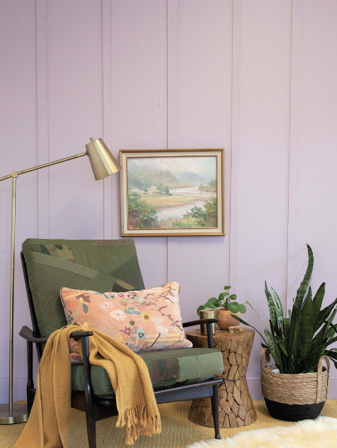
Miller believes that as we heal from the pandemic, we are more in touch with our humanity, deepest desires, and personal fulfillment. A collective wish for new beginnings leads us to thoughtful hues that support renewal, reflection, and a sense of optimism. Our Color of the Year, Desireé | 1219 — a softly-shaded orchid hue — goes deep within, in order to lift us out.
Now we turn to AzkoNobel and we find another natural color on the horizon.
AzkoNobel
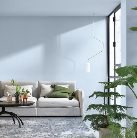
The forecast calls for Bright Skies™ in 2022, with the reveal of AkzoNobel’s Color of the Year. The airy, light blue feels like the breath of fresh air we all need.
After a spell of feeling shut in, people are craving expansion. Extensive global trend research conducted by a team of in-house paints and coatings color experts and international design professionals reveals that we want open air, connections to the great outdoors and a fresh approach to everything.
Many events over the past two years have thrown the social, economic and environmental aspects of our lives into sharper focus. We’re reassessing what really matters: family, friends, home and the world around us.
“In 2022, Bright Skies will help us embrace new ideas and shape a new future,” says Heleen van Gent, Creative Director of AkzoNobel’s Global Aesthetic Center. “The color reflects the limitless skies above us, giving us the space to redefine the role of our homes, nature, the arts and new voices in our lives. As consumers look to express themselves and transform their spaces, our aim as color experts is to inspire their color confidence.”
Finally, Dunn-Edwards has come up with a color that feels both nature-inspired and timeless.
Dunn-Edwards Color of the Year
“Art and Craft” channels shades of the 1970s, Old World Sophistication, and the Sumptuousness of Suede. This autumnal hue is a warm and earthy shade that allows for a large range of play with creativity and change.
“Optimism means embracing reality and new opportunities. We see our color and design choices mirroring our inner needs as we are challenged to build new paths,” said Sara McLean, Color Expert and Stylist for Dunn-Edwards. “Art and Craft is a timeless shade that embodies both the past as well as the optimism and excitement of the future.”
Art and Craft (DET682) is represented in Dunn-Edwards 2022 color + design trends story “Naturrensing.” This trend highlights the need to cut back on clutter, refocus on what’s essential and get in touch with our earth-loving roots.
Art and Craft is a nature-based hue that is moody and complex yet versatile. Its sophistication complements surrounding colors, acting as a foundation and tying other colors together. To achieve this, try Dunn-Edwards suggested color scheme of Art and Craft (DET682), Cotton Club (DET431) and Gypsum Rose (DET452).
Emerging from quarantine brought a new admiration and wonderment for nature and human connection, and Art and Craft meets the needs of those seeking calm and adventure alike. Earthy neutrals and warm tones connect us with the reality around us. Whether it’s the chocolate brown hills or rocky mountain paths, we feel the most connected when we’re outside. This is our Mother Earth.
A new generation of designers are giving classics a modern spin with the cottagecore and light and dark academia aesthetics. We see a resurgence of traditional colors from these slower time periods, including browns consisting of umbers, ochres, walnuts, and clay browns.
Also inspired by the 70s bohemian flair and folkloric design, Art and Craft connects to trends of earthy hues through fashion, furniture, and design. Pulling from the whimsical country style, prairie gardens, and organic hues of the time, we continue to trend forward showcasing the best of this free-flowing decade.
Art and Craft is a grounding color that taps into nourishing, stabilizing, and calming atmospheres. As an alternative to black, brown is softer and warmer, generating feelings of wholesomeness. The color connects directly with nature and its peaceful elements.
“This is a versatile color that we expect to see applied across a variety of industries and disciplines throughout 2022,” said McLean. “I see bohemian glamour and a touch of autumn in Paris. Art and Craft is truly a down-to-earth color that signifies stability, comfort, and calm, a color that expresses what we all seek right now.”